The Challenge
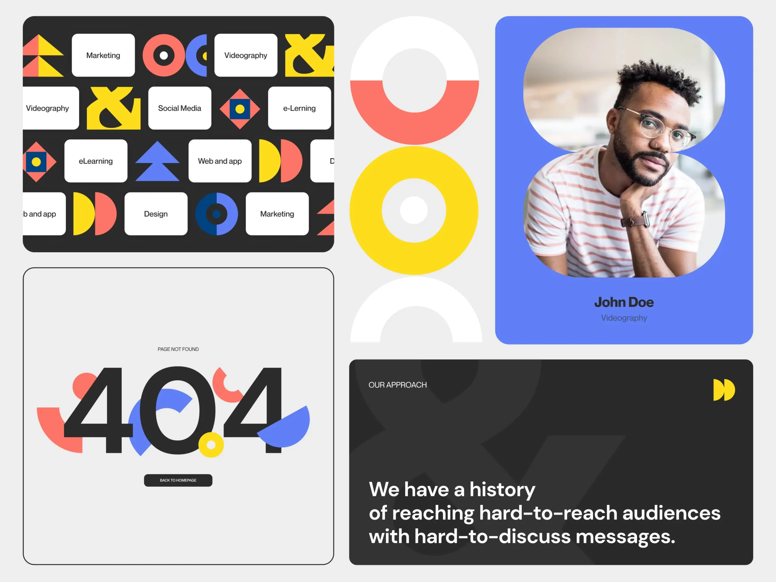
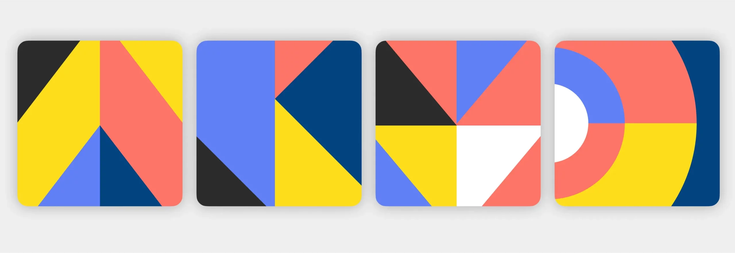
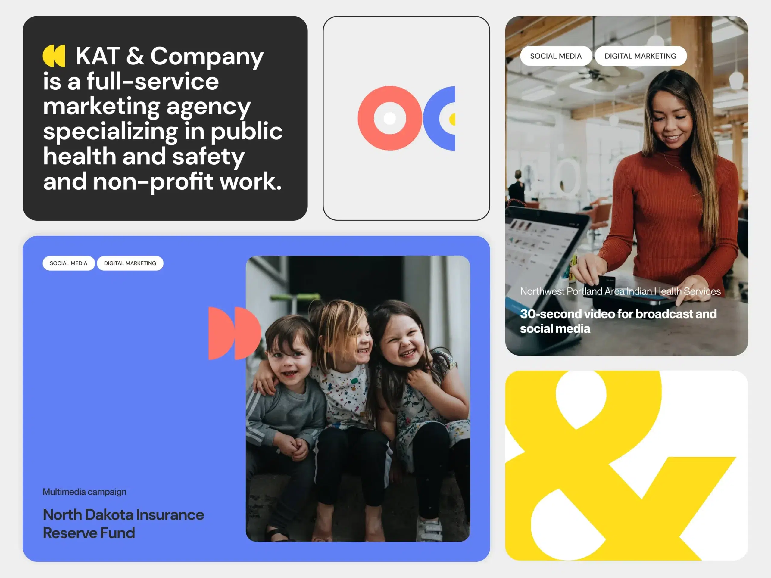
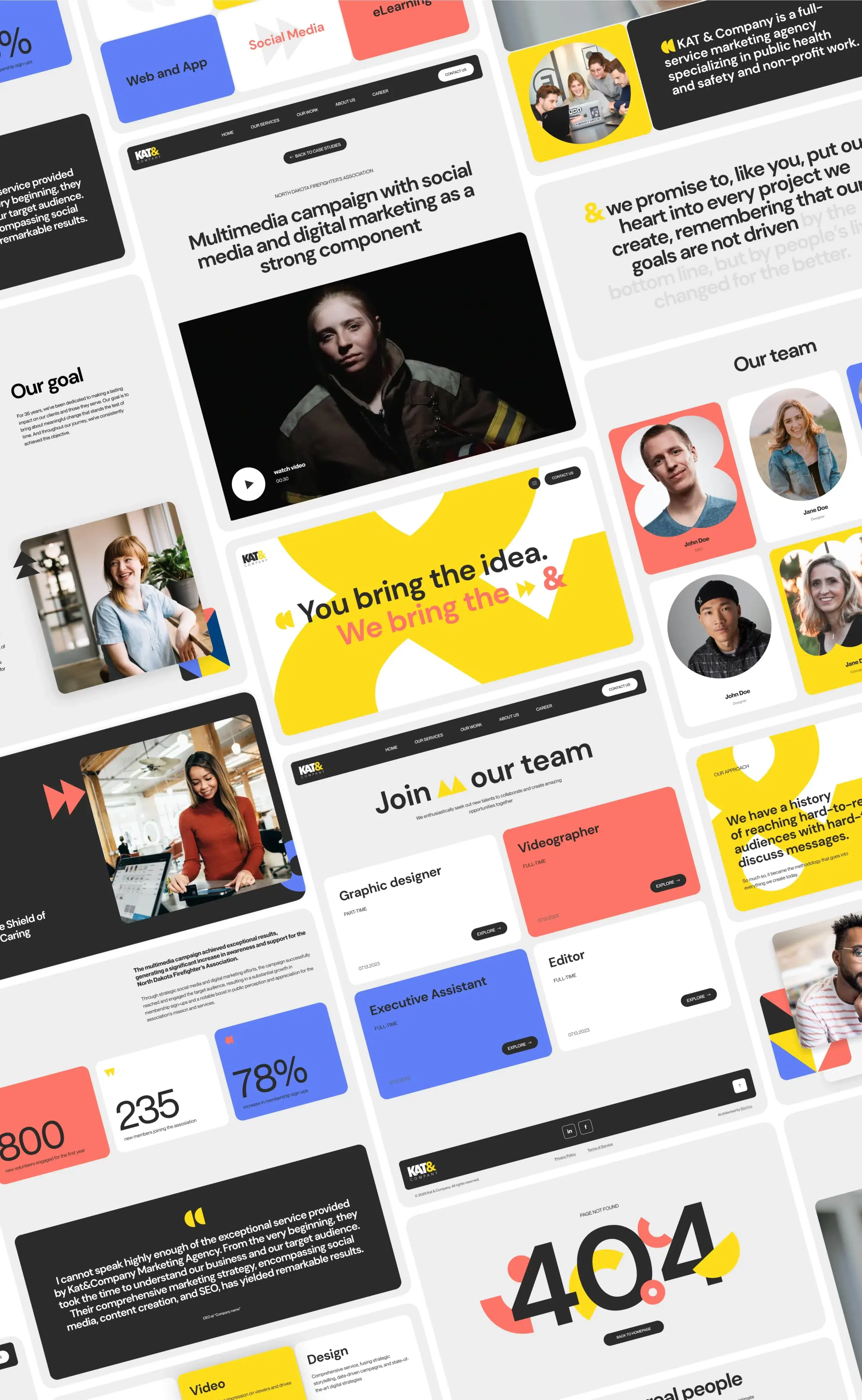
The primary challenge was to communicate with an audience through visuals and animations. KAT&Company specifically wanted an ampersand, a recognizable element of their logotype, to be a central design feature. This ampersand was envisioned as a character that navigates through the website, conveying the company’s most powerful messages. In addition to this complex task, we needed to find a way to express their energetic, caring, and vibrant attitude through graphic elements and colors.

