Mobile-first approach
Considering the tourist-centric nature of the location, we opted for a mobile-first approach. After all, you’re always carrying your smartphone.
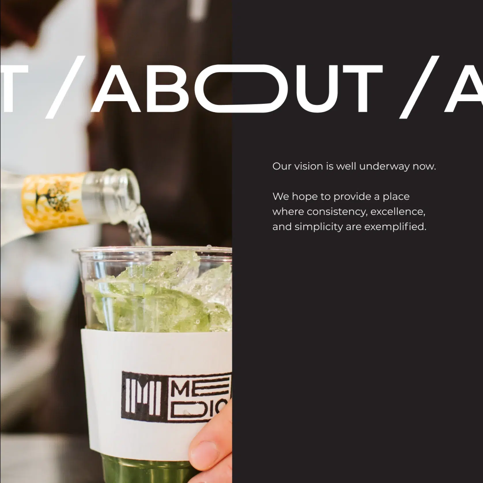
We steered clear of typical ‘restaurant website’ clichés where everything essentially converges on a single point: the menu. Instead, we developed a design language that provides enough room for every individual aspect to shine while painting a bigger picture.
Opting for a carbon color palette, we let contrast do most heavy-lifting, leaving room for photos to blend beautifully into the clean, easygoing design.
