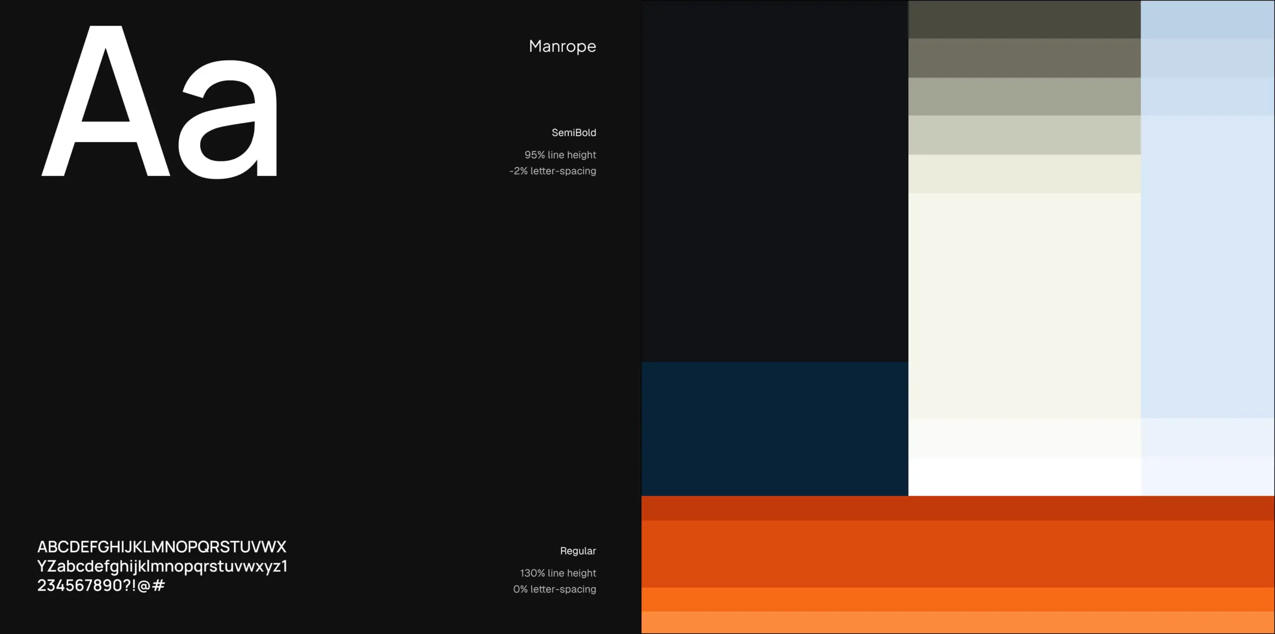
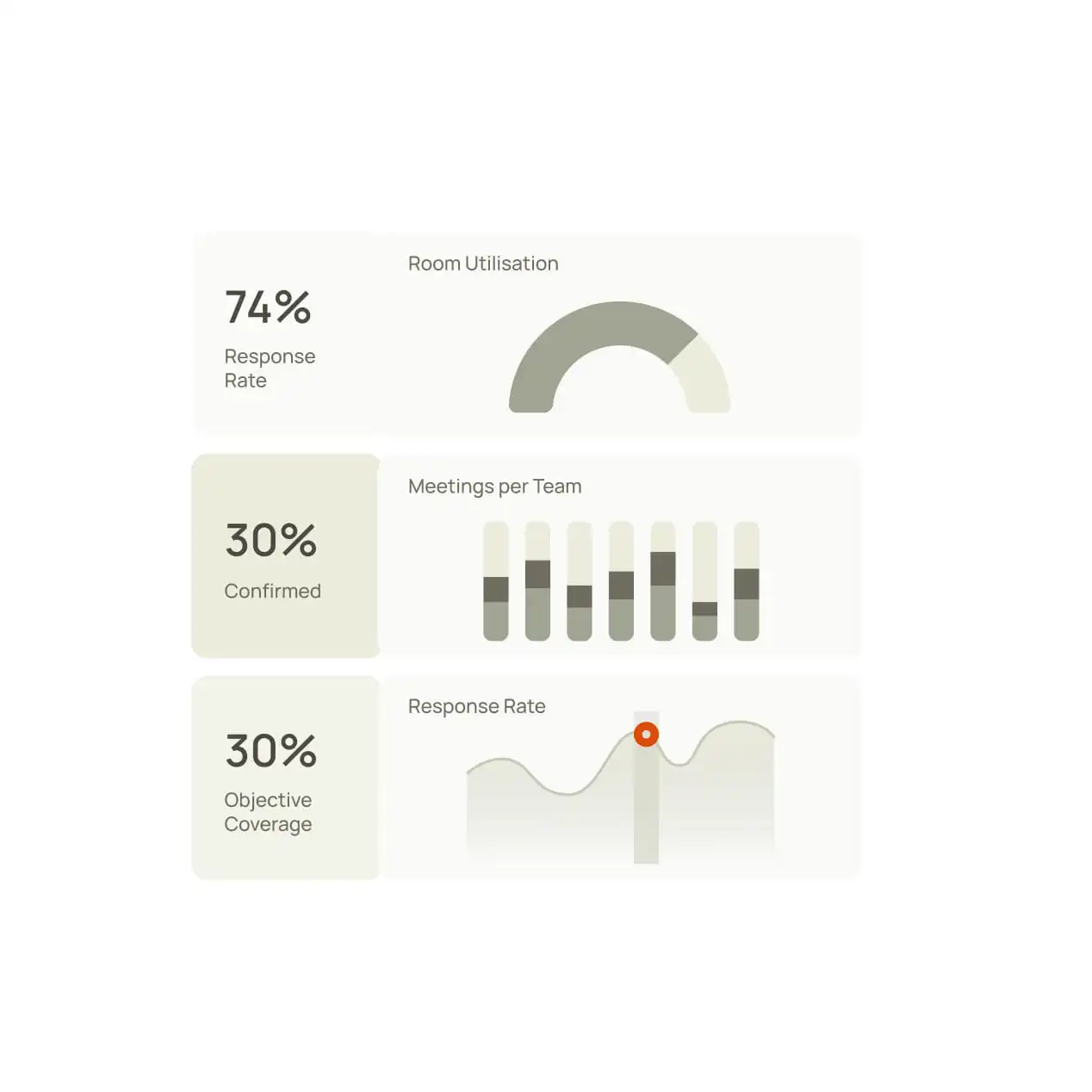
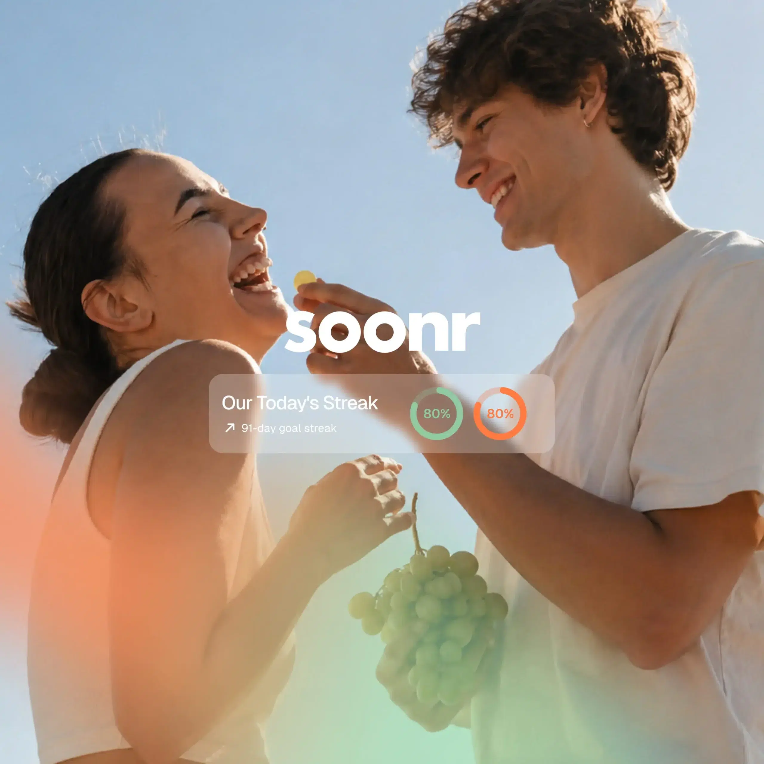
Rather than relying on multiple dominant colors, we built the identity around tonal variation. Different shades of olive create depth across illustrations, graphic elements, and interface components, giving the brand a recognizable visual rhythm without overwhelming the content.
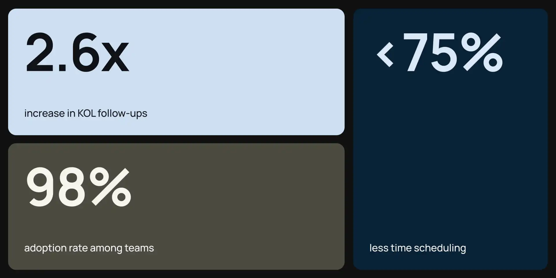
Warm neutrals soften the overall palette, while orange and navy remain carefully controlled accents. Their role is to direct attention rather than compete with the core identity.
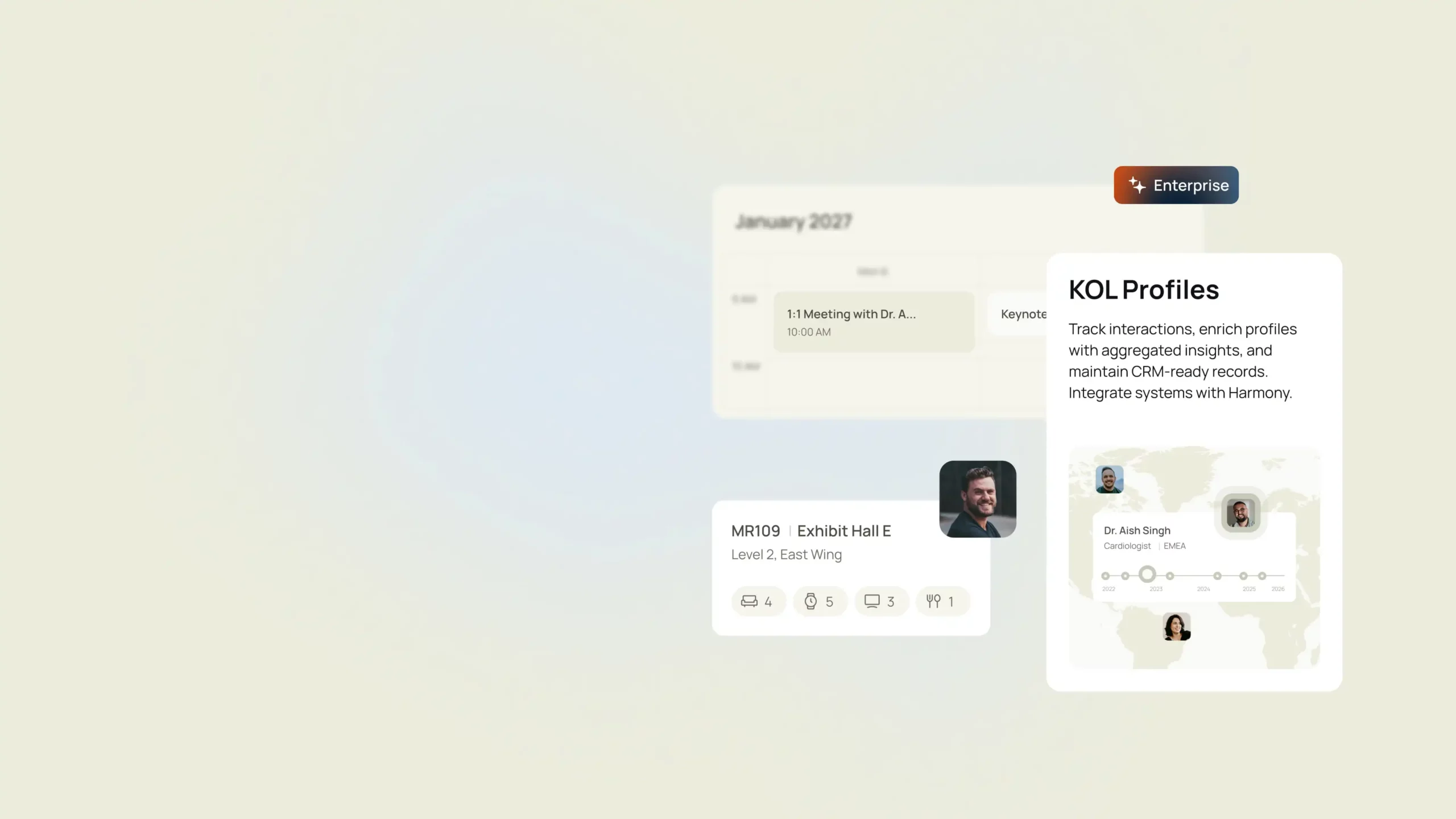
Blur became another defining part of the visual language. More than an effect, it helps establish hierarchy, separate primary information from secondary details, and guide attention across illustrations, website sections, and supporting graphics.